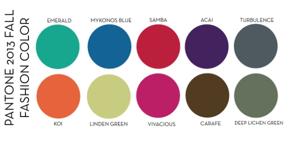
As we learned in a previous post the Fall 2013 Color Story is as follows:
Emerald, Mykonos Blue, Linden Green, Acai, Samba, Koi, Deep Lichen Green, Vivacious, Turbulence, and Carafe
Let’s explore these colors in a visual way using JCrew’s Fall 2013 Collection. I know for some it’s easier to see how a concepts works, when it’s right in front of them. JCrew’s use of color in each collection are like no other. They really understand how to utilize color theory to add interest to their collections.

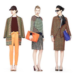
Merino Tippi Sweater , Collection Cashmere Tile Sweater in Moss , Collection Printed Calf Hair , Everly Mirror Metallic , Etta Pump (similar) , Collection Everly Calf Hair Pumps , Stripe Necklace Tee
Embroidered Cascade Necklace , Octagon Necklace
The above merchandise visual is a perfect example of how analogous and complementary colors can work together. On the first model you see how colors directly next to each other on the color wheel can work together. Red (Samba) and Orange (Koi) are directly next to each other, which mean that one of the colors was used to create the other. If you think of analogous colors in that way you can see why they works well with each other. The second and third models are perfect examples of how colors opposite each other (complementary) can be an ideal combination. Lets focus on the third model, you can see how Orange (Koi) and Blue (Mykonos Blue) are used in the suits pattern and accessories to play off of each other. Because they are opposite each other on the color wheel, each color is given its proper shine. In other words, neither color over powers the other; they both are highlighted equally.
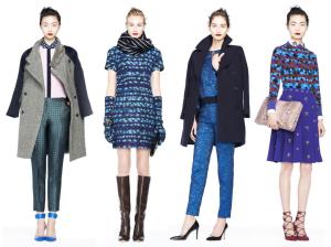
Below you will see some perfect examples of why a monochromatic color palette is always classic.

Silk Boy Blouse in Owl Print, Collection Café Capri in Moroccan Windowpane (similar), Dress (similar), Scarf (similar), Top (similar), Pants (similar), Double-Cloth Lady Day Coat, Embellished Skirt (similar), Patterned Sweater (similar)
I hope you are one step closer to understand the relationships that colors have with each other, so that you can step out and make some bold color choices.
Until next time…

